Tenacious G
Guitar Rig has been a staple in the Native Instruments lineup for a long time. It was a product featured in one of Steve Jobs keynotes back in the days which was a very proud moment in NI’s history. Guitar Rig 1 to 5 had been through the hands of Philipp Granzin and Philipp Roller aka Phirol, two pillars of Native instruments design history.
In 2019 it was decided to refactor the UI side of GR to a more modern framework enabling scalability in order to support hiDPI displays and bring GR into the future. The brief was expected: make it with vectors but make it look like 3D.
3 degrees of separation
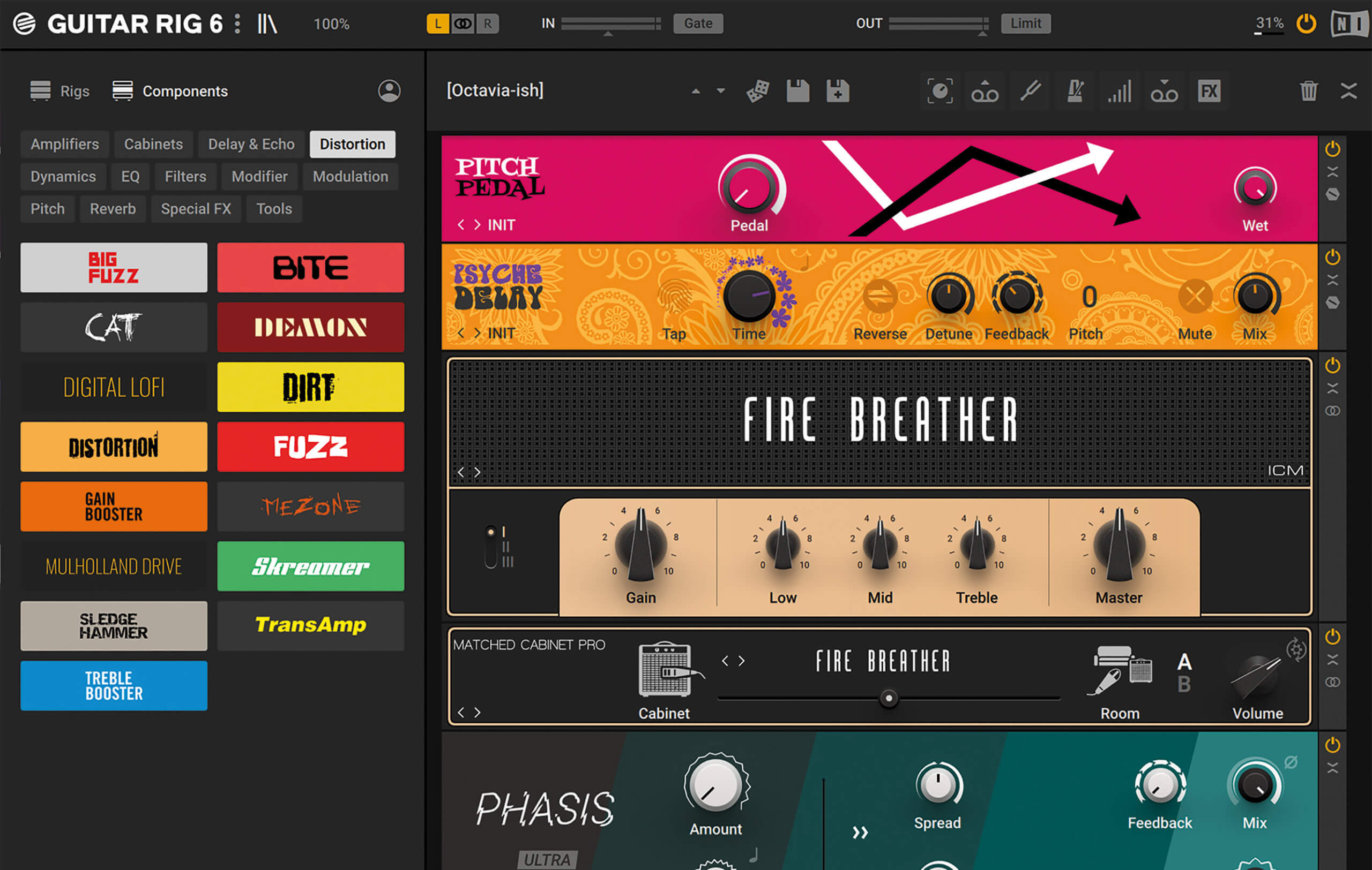
One thing I wanted to improve was the impression of not knowing where to start.
Guitar Rig components had often knobs with a similar look, some with a very systematic layout and a rack of several of those would often lead the eye to jump around not knowing where to rest its attention.
I wanted
- the first knob to the left to call for attention and be the entry point in each Component.
- secondary control would be smaller and their arrangement would have more dependency on the actual device than an overall guideline
- expert controls would be flat
No Rules withtout exceptions
Rules were as often spiced up with exception, most notably for the amps here which deserved to work as strong punctuation in the rack. But in general the One knob as an anchor worked for the majority of the components helping user to read vertically through a rack and know by following form which parameters would have the most impact.
It may sound surprising but the idea that a flat text or element with zero framing could be acceptable as an interactive element took a while to gain acceptance. I believe I started pitching it as early as 2010 when I joined. Too early.
shaded not decorated
It was very important to me to get rid of any gratuitous decoration - outside of background patterns and colors - in order to establish that anything you see as an element is most likely interactive.
One exemple are the flat VU meters on the compressors as an exemple was something I had already pitched for the original versions a couple years before. Was too early and GR6 was the opportunity I took to finally do that.
more but less
We managed to make expert parameters small and flat and insert them in the panels directly.
The result is that despite most components being large than GR5, if you open all exprt paramaters, most of the time a GR6 rack will end up being shorter than in previous version.
Qt
As we used Qt I took the opportunity to code a lot of the UI myself like I did with Massive X.
One noteworthy element is the scale which I managed to make flexible enough to work as knob scales as well as VU meters scales.
It can be made flat like some 80s hifi VU meter scales and retain the increment spacing consistent to the the needle angle. VU meters are literally a tiny knob, elongated indicator and large scale.
100+ components

All work displayed is copyright of their respective owners. Portfolio pieces are presented for the sole purpose of demonstrating my individual contribution and design process.